


Collections
${item.title}
No results found
Design
${item.title}
No results found
Collaborators
${item.title}
No results found
Colours
Requires a Professional Account
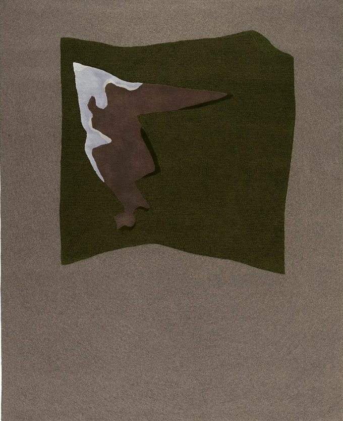
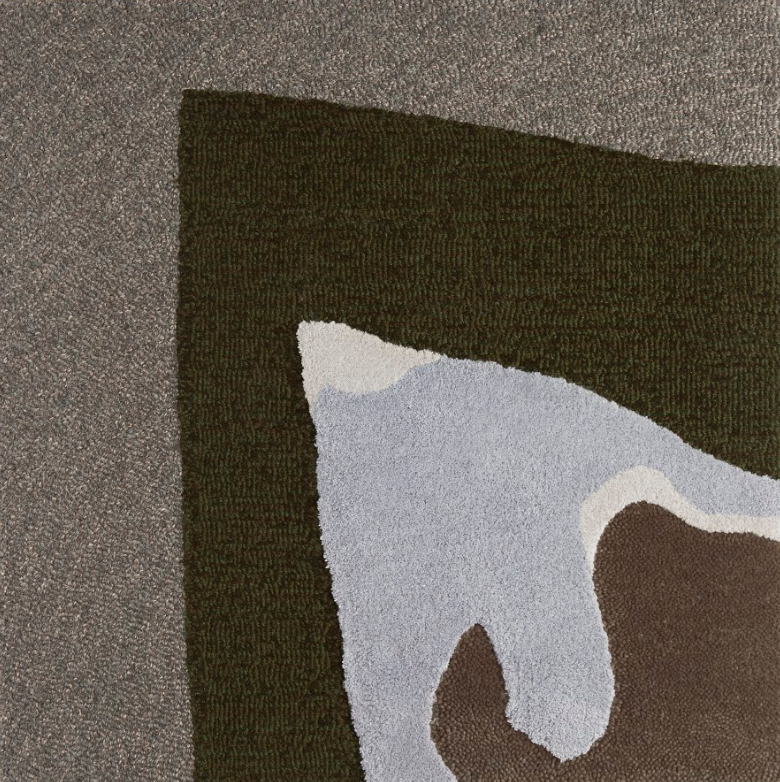
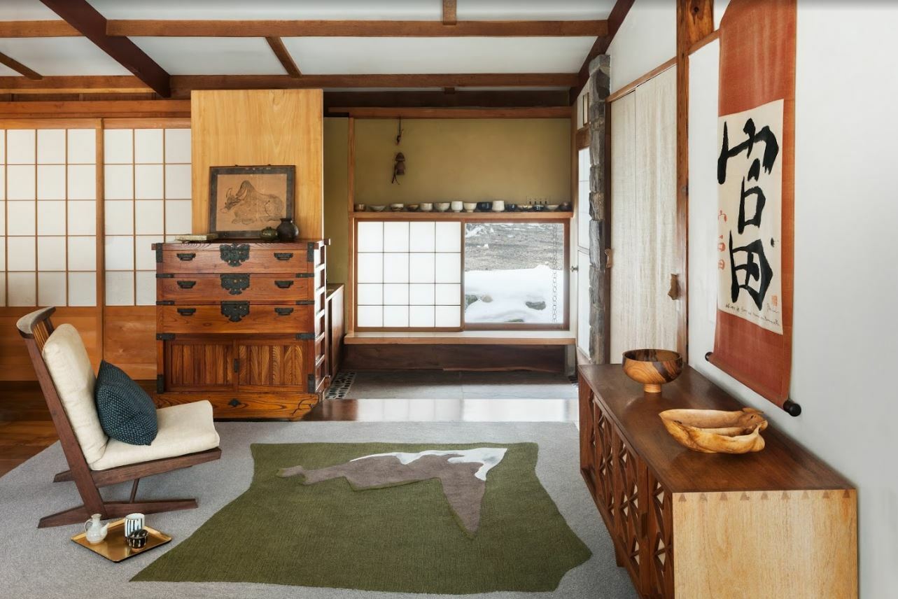
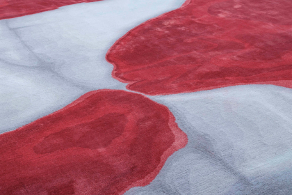
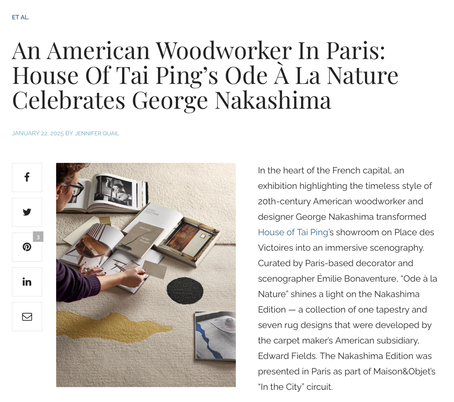
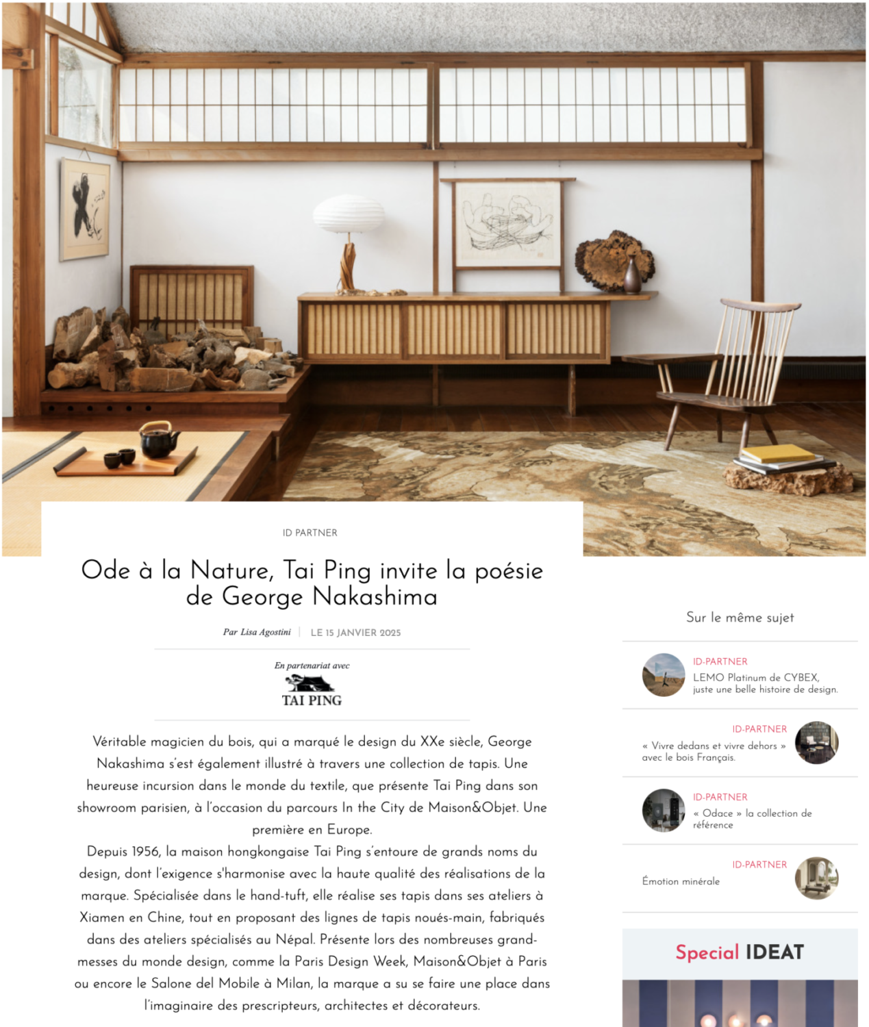
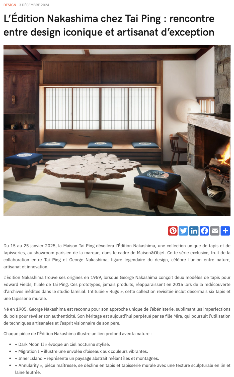
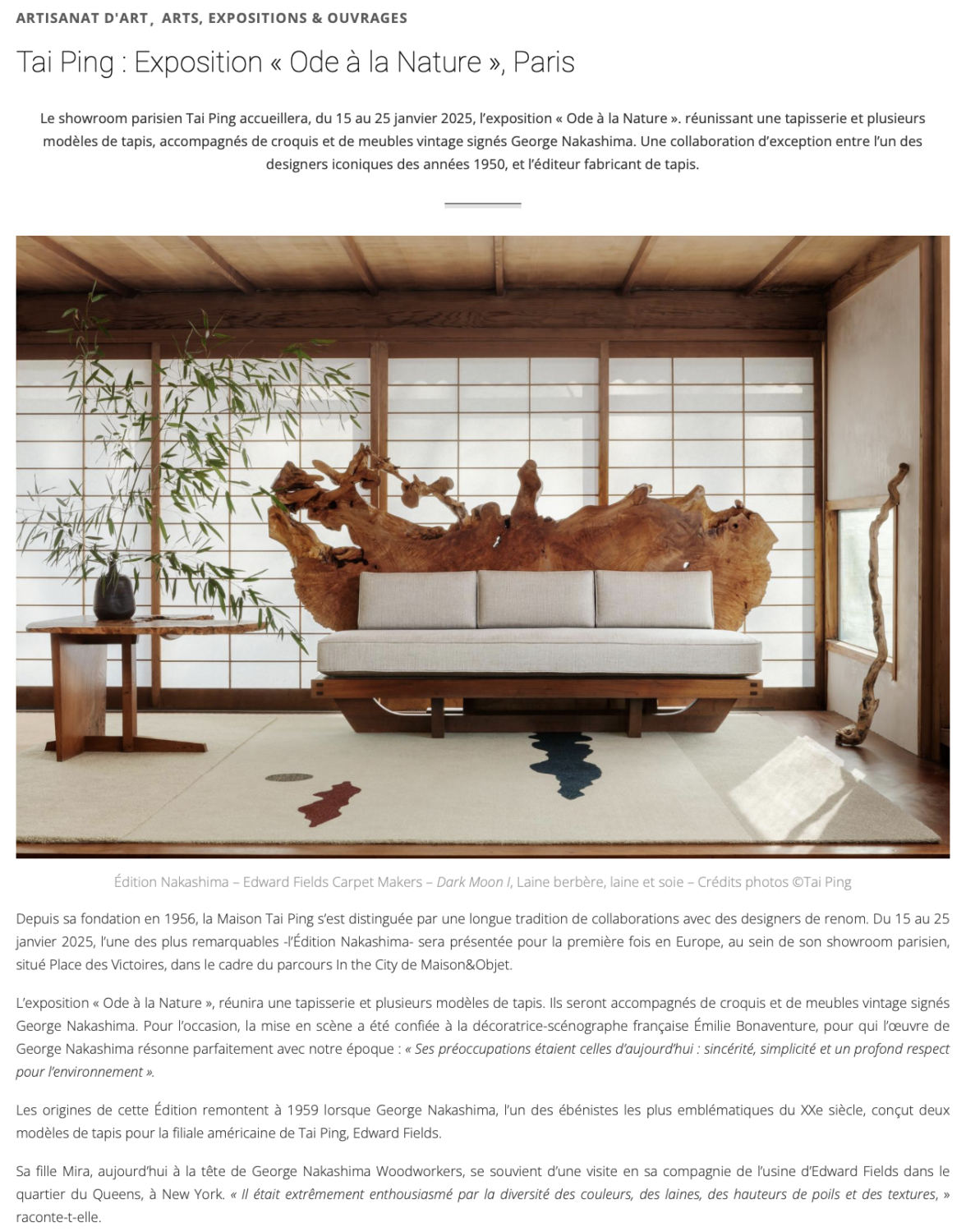
“Inner Island” means “Nakashima” in Japanese. The drawing featured a squarish island with a snow-topped angular mountain representing an example of George Nakashima’s profound inspiration from nature. This design was never manufactured as a rug but following Nakashima’s notes found on the sketch, an interpretation was crafted by the Edward Fields creative team and Mira Nakashima to create a piece made of different deniers of wools mixed with accents of silk in a color palette of forest green, brown and icy blue, Inner Island I. A second interpretation was made in textured wools in grey and blue tones juxtaposed to the shine of silk, Inner Island II. All designs in this edition are expertly tufted by skilled artisans.
George Nakashima
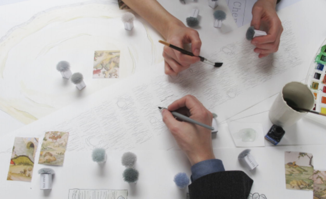
George Nakashima was trained in architecture then turned to furniture-making, and he was first to make woodworking a fine art. He collaborated with Edward Fields in late 1950s by creating a series of drawings to be translated into rugs that resulted in two pieces in 1959. These rugs were the start of a new collaboration between Nakashima’s children, Mira and Kevin, and the Edward Fields design team. This amazing team effort brought the collaboration to a new level by interpreting a packet of 60-year-old Nakashima sketches into a new series including six rugs and one tapestry launched in 2015.
© 2025 Tai Ping Carpets International Limited. All rights reserved.


